Brand Guidelines
Our visual system is dynamic, distinct and professional. The brand elements are flexible enough to bring concepts to life in a compelling and intuitive way, without ever overwhelming or confusing the audience.
Reltio logo
The Reltio logo is the most visible representation of our brand and the unifying visual element that appears across all communications and channels.
The flowing R is the beginning of a system that creates a sense of motion, speed and accelerating data value.
Our symbol is custom-drawn to be proprietary for Reltio. It should not be redrawn, distorted or altered in any way.
Use of the Registered Trademark Symbol (®)
The Reltio® logo, Reltio®, and Reltio Data Cloud® are registered trademarks. Use the ® symbol on the first prominent instance of our logo, company name, and the name of the product—whether on a web page, presentation slide, promotional item, trade show booth, or other branded material. It’s okay to omit the symbol in later appearances or when space is limited (like on small icons or internal materials). Trademark protection still applies even when the symbol isn’t shown.
Clear space & minimum size
Clear space and minimum size are tools used to protect the impact of our brand. They work to ensure the logo is always clearly visible and is able to stand out wherever it appears.
Clear space is the minimum “breathing room” maintained around our logo. It is kept free of graphics, text, and other marks. It also defines the minimum distance between the logo and the edge of a printed or digital piece.
Be sure the minimum amount of clear space around the logo lockup is equal to the height of the letter “R.”
Minimum size refers to the smallest allowable logo. The minimum size for the logo is 15 mm wide for print and 65 pixels wide for digital applications.
Logo variation
The Reltio Blue or “positive” version of the wordmark is the primary use. However, there is a additional version of the Reltio wordmark for “reverse” use. The “reverse” version of the Reltio wordmark is white for use on color or photo backgrounds for maximum readability.
Always use the correct digital artwork for the “positive” or “reverse” application of the Reltio wordmark. Artwork in various digital formats is available; please contact the marketing team.
Monogram
Our monogram is the most compact expression of who we are. Only use our shorthand logo for digital applications, particularly social media and app icons.
Color usage
The primary monogram should be the special gradient color on Reltio Midnight. For special cases, the monogram may be used in Reltio Blue.
Clear space
Be sure the minimum amount of clear space around the shorthand logo is half the height of the R.
Minimum size
The minimum size for the shorthand logo is 21 pixels wide for digital.
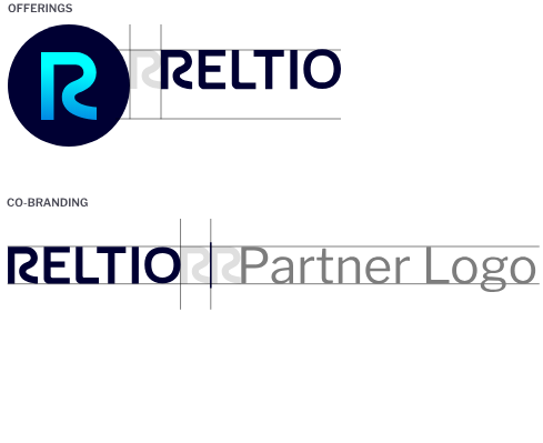
Offerings and co-branding
As our most recognizable and valuable visual asset, use of our logo with other logos or offerings must follow strict rules.
Offerings
When necessary, the Reltio monogram and logo can be used to create logo lockups for specific offerings. Refer to the diagram on the right for specific guidance on creating these lockups. A complete list of approved offering lockups can be requested from the marketing team. In these offerings, the Reltio wordmark can appear in Midnight,* in order to create visual consistency and simplicity.
Co-branding
The Reltio and partner logos appear side by side and separated by an Midnight vertical bar. The Reltio logo should appear in Reltio Blue.* It is preferred that the partner logo follow the Reltio logo unless the agreement determines otherwise. Refer to the diagram on the right.


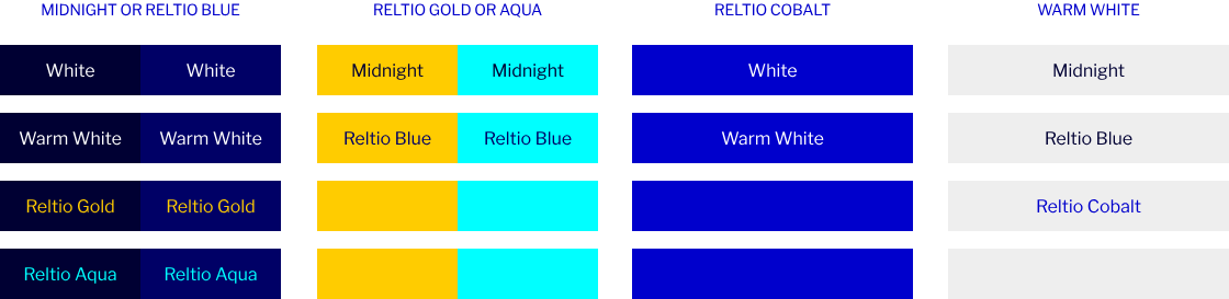
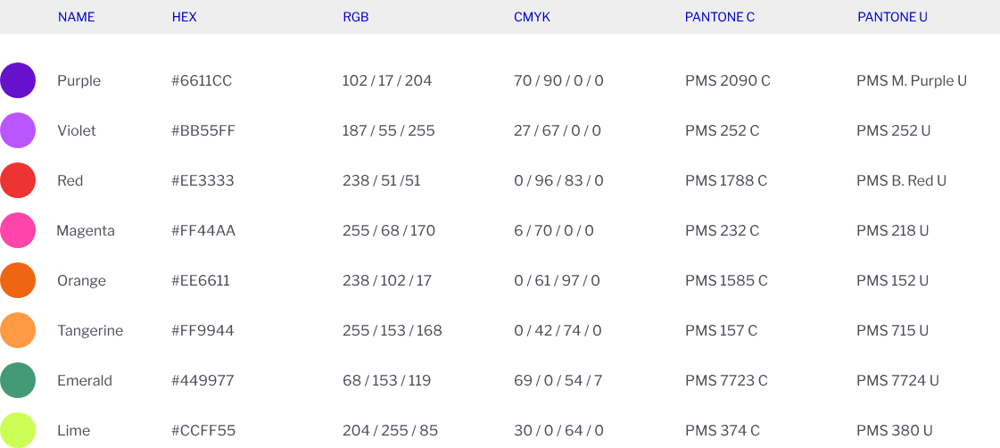
Brand colors
Our primary color, Reltio Blue, along with our secondary and accent colors, expresses our confident, sophisticated, high-value approach. Reltio Gold and Reltio Aqua speak to our speed and flexibility.
In addition to our primary brand colors, we use a palette of accent, neutral and secondary supporting colors on our communications.
When used consistently across all of our communications, they help differentiate us from our competitors. Reference this color wheel to confirm that your balance of color is on brand.
Secondary colors are limited use and should be used for charts and product UI only.

Primary Colors

Accent Colors

Color and accessibility
Ensure our materials are easy to read and meet color contrast accessibility requirements when placing on-screen text over color — such as on buttons, infographics, or tables. Large text is defined as 14 – 18 point (typically 18.66px – 24px) or larger.
Check color contrast here.
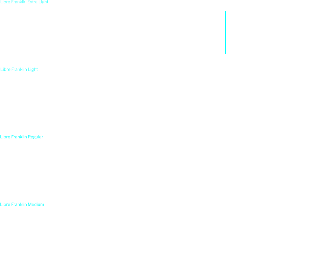
Typography
Our new primary typeface is Libre Franklin. It’s a versatile sans-serif, suitable for both long-form text and headlines.
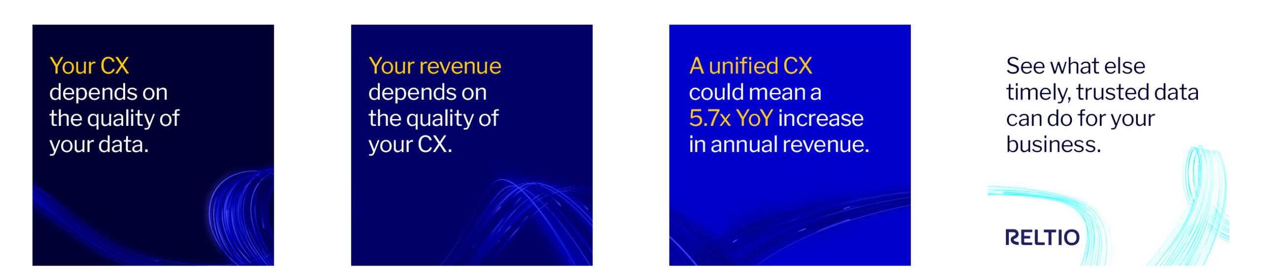
To highlight value to our customers we use Gold color on dark background and Cobalt color on light background.
Make sure that you test contrast ratio.
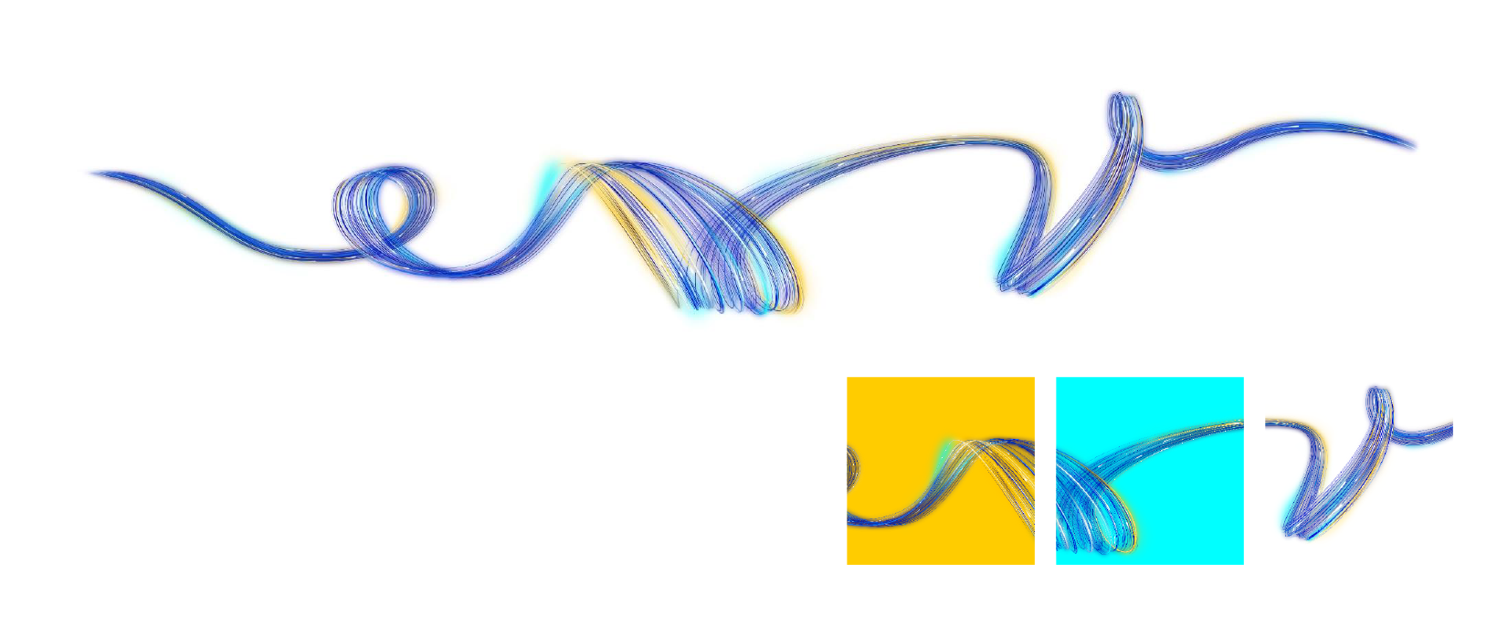
Datawave
The Datawave has been specially created to provide a proprietary look for Reltio. The library includes the full wave on for both dark and light backgrounds.
Please note – The dark and light versions are different and should only be used as indicated. The Datawave artworks have been created as high-resolution illustrations. They can be scaled down, but should not be upscaled.
The Datawave has been created as a Canvas, and should be cropped in creative and interesting ways, fitting any given format. It should never be used in its full, uncropped size.
Reduced Color Versions – In addition to the Datawave on Dark and on Light there are also reduced color versions that can be used as background graphics, where the full color wave would be distracting.
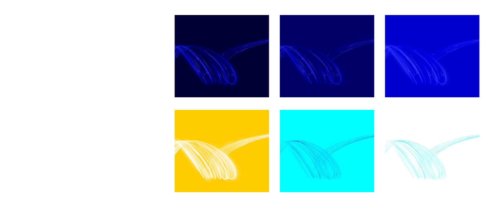
Reltio datawave on dark
To be used on Reltio Blue, Midnight and Cobalt.
Full canvas shown.
Reltio datawave on light
To be used on Reltio Gold, Aqua and White.
Full canvas shown.
Reltio datawave reduced
Various examples shown.
Reltio datawave animated
An animated Datawave was created for use on banners, web, OOH, video, etc.
The graphic elements library includes the Datawave on dark and light backgrounds. Animations will usually be custom made for their individual need, with the library being updated constantly.


Use with photography
Use only the labeled wave graphics for light or dark backgrounds.
Position the datawave behind the subject, centered horizontally.
Scale and crop so it flows behind the subject with clear space in between.
Place complex areas of the wave behind the subject for a cleaner layout.
Use only the correct light or dark background version when combining the data wave with photography.
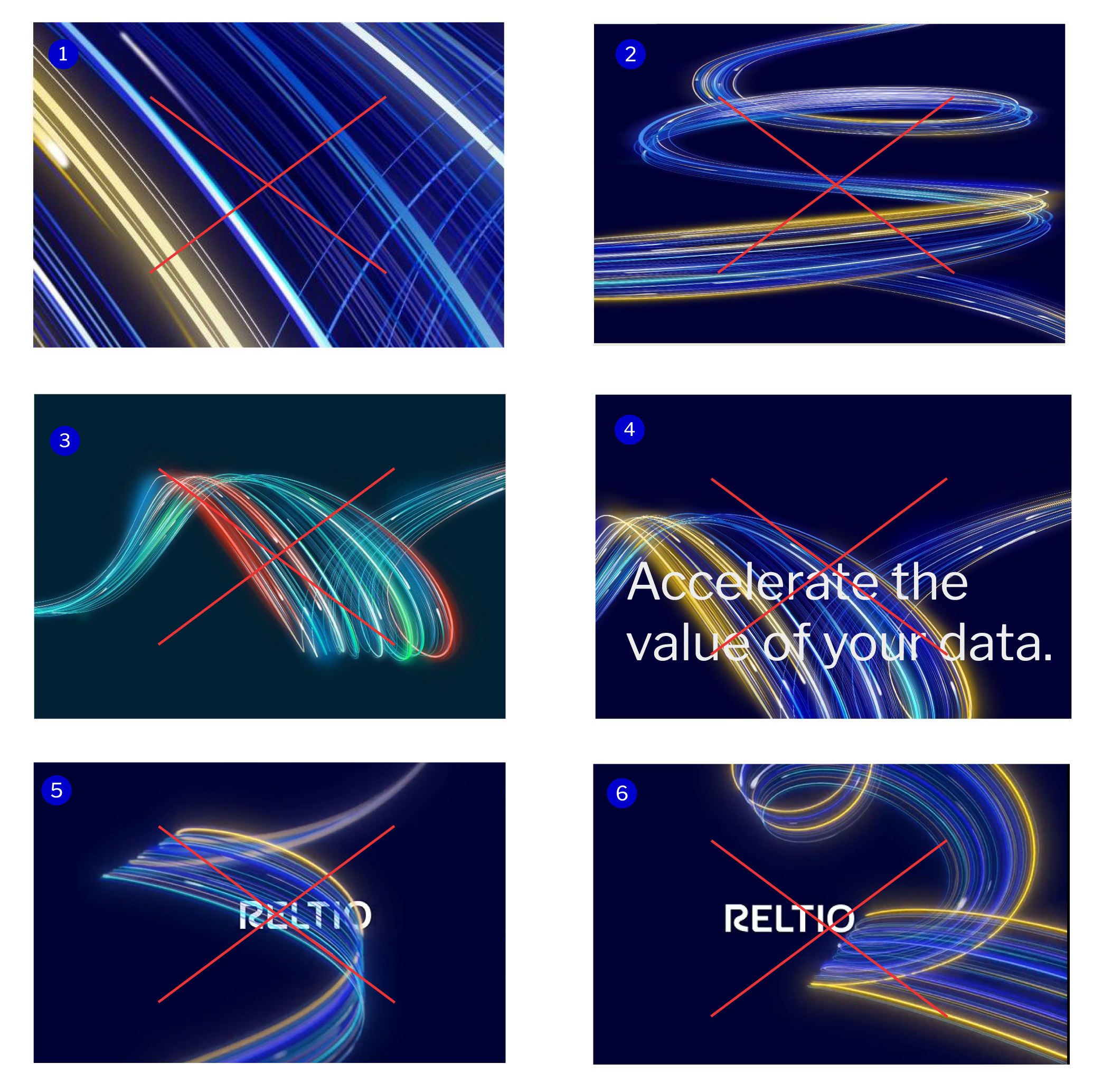
Misuse
Always use approved artwork in correct colors when working with the data wave graphic. Do not alter the graphic in any way.
Avoiding these mistakes will help build consistency and recognizability for the brand.
- Do not scale the Datawave graphic at an extremely large size to prevent the image from getting lost.
- Do not stretch or scale the graphic in extreme ways.
- Do not change the gradient colors of the data wave graphic.
- Whenever possible, do not (or limit) overlapping copy over the data wave graphic so the text remains legible.
- Avoid extreme vertical use. The wave can be used on angles, but should not be used upright.
- Do not recreate ‘similar looking’ Datawaves, or replace with stock images.
Photography
The Reltio photography style is confident, candid, diverse and contemporary. Our photography is primarily focused on people to convey Reltio’s persona of the Agile Ally. It must show empathy, understanding, and feature subjects that a wide audience can relate to.
Our photography should always reflect:
- Portraits of diverse professional individuals
- Candid expressions and actions
- Real people in clean indoor environments
- Candid, unscripted moments
Perspective
Portraits are typically shot from the front or slight off-center of the subject.
Focus
A shallow depth of field with soft backgrounds keeps our photography uniform and helps when adding the data wave into photos.

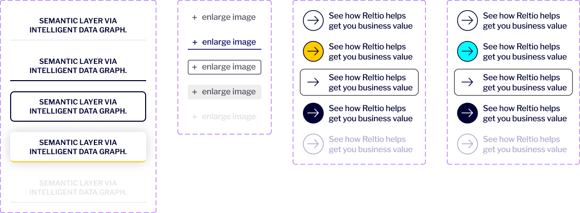
Iconography
We’ve created a customized, flexible, distinctive, style for icons incorporating data points like the Data Wave to extend our visual brand identity and help communicate ideas simply, boldly and clearly. They are custom-drawn to cleverly use linear and dot elements in a number of different ways.
Icons should be used sparingly as a “visual shorthand” that visually illustrates ideas and they should always serve a communications purpose and never be used as abstract decoration.

Starter library
We have a limited library of icons that communicate our key capabilities and product offerings. When creating new icons be sure to follow our principles for consistency and readability.
Color variations
Icons on white and light backgrounds must only use Midnight and Reltio Blue colors only. Reltio Blue, Reltio Cobalt, and Midnight background can only interchange the Reltio Aqua or Reltio Gold with white line strokes. A library of icons has been created in a variety of file formats.
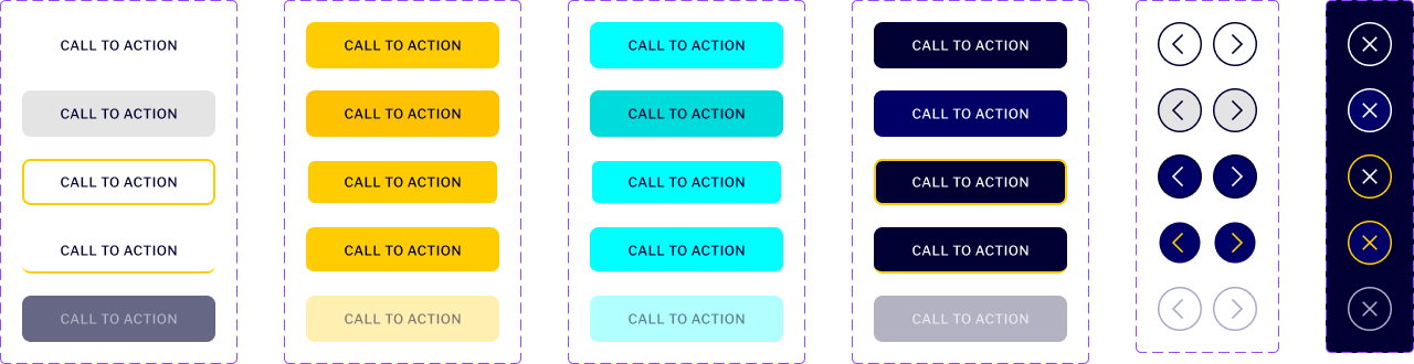
Buttons and hyperlink colors
Color is a powerful tool in the digital space for signaling clickability and directing the user’s eye to calls to action. It is important that our use of color in web follows the guidance for accessibility on 24.
For HEX codes, please see the color breakdowns in the colors section above.