Clear space & minimum size
Clear space and minimum size are tools used to protect the impact of our brand. They work to ensure the logo is always clearly visible and is able to stand out wherever it appears.
Clear space is the minimum “breathing room” maintained around our logo. It is kept free of graphics, text, and other marks. It also defines the minimum distance between the logo and the edge of a printed or digital piece.
Be sure the minimum amount of clear space around the logo lockup is equal to the height of the letter “R.”
Minimum size refers to the smallest allowable logo. The minimum size for the logo is 15 mm wide for print and 65 pixels wide for digital applications.
Logo variation
The Reltio Blue or “positive” version of the wordmark is the primary use. However, there is a additional version of the Reltio wordmark for “reverse” use. The “reverse” version of the Reltio wordmark is white for use on color or photo backgrounds for maximum readability.
Always use the correct digital artwork for the “positive” or “reverse” application of the Reltio wordmark. Artwork in various digital formats is available; please contact the marketing team.
Monogram
Our monogram is the most compact expression of who we are. Only use our shorthand logo for digital applications, particularly social media and app icons.
Color usage
The primary monogram should be the special gradient color on Reltio Midnight. For special cases, the monogram may be used in Reltio Blue.
Clear space
Be sure the minimum amount of clear space around the shorthand logo is half the height of the R.
Minimum size
The minimum size for the shorthand logo is 21 pixels wide for digital.
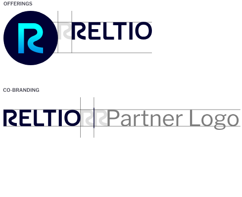
Offerings and co-branding
As our most recognizable and valuable visual asset, use of our logo with other logos or offerings must follow strict rules.
Offerings
When necessary, the Reltio monogram and logo can be used to create logo lockups for specific offerings. Refer to the diagram on the right for specific guidance on creating these lockups. A complete list of approved offering lockups can be requested from the marketing team. In these offerings, the Reltio wordmark can appear in Midnight,* in order to create visual consistency and simplicity.
Co-branding
The Reltio and partner logos appear side by side and separated by an Midnight vertical bar. The Reltio logo should appear in Reltio Blue.* It is preferred that the partner logo follow the Reltio logo unless the agreement determines otherwise. Refer to the diagram on the right.